Problem Statement
Can one dashboard make a 320+ project portfolio easier to govern?
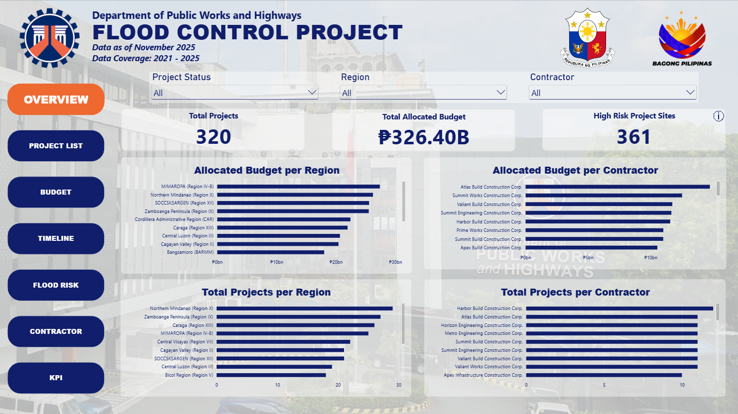
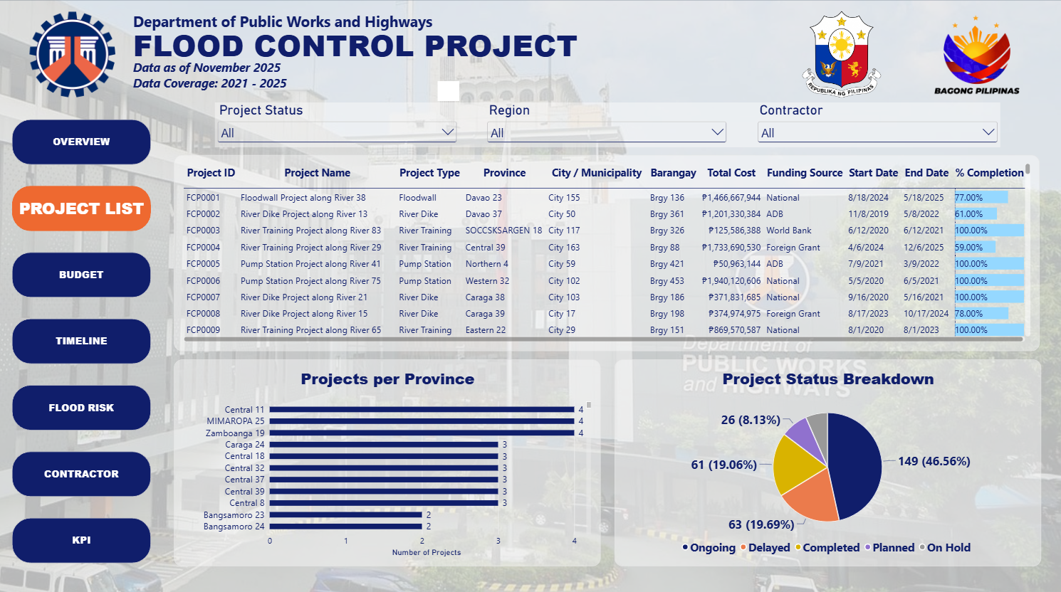
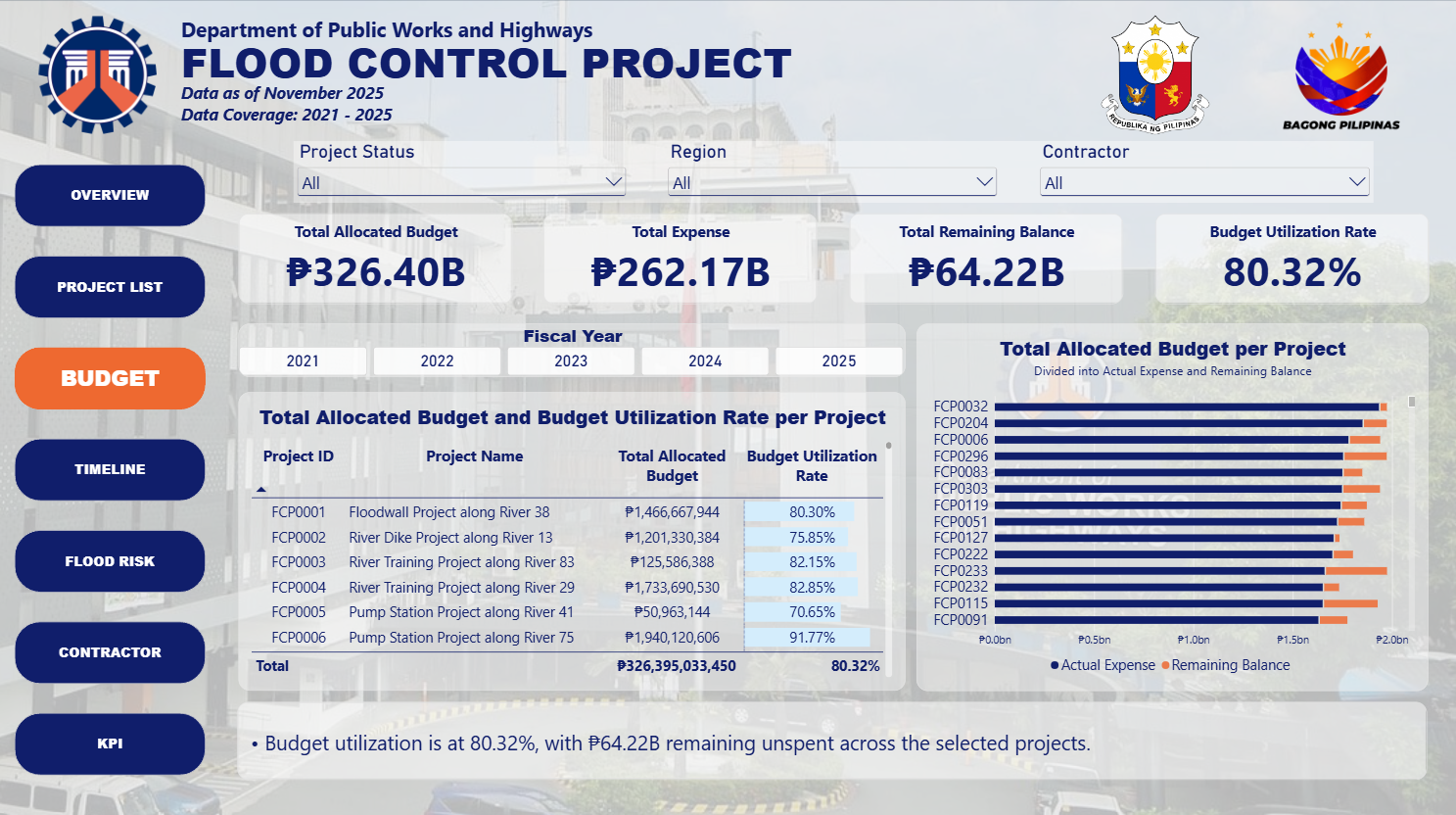
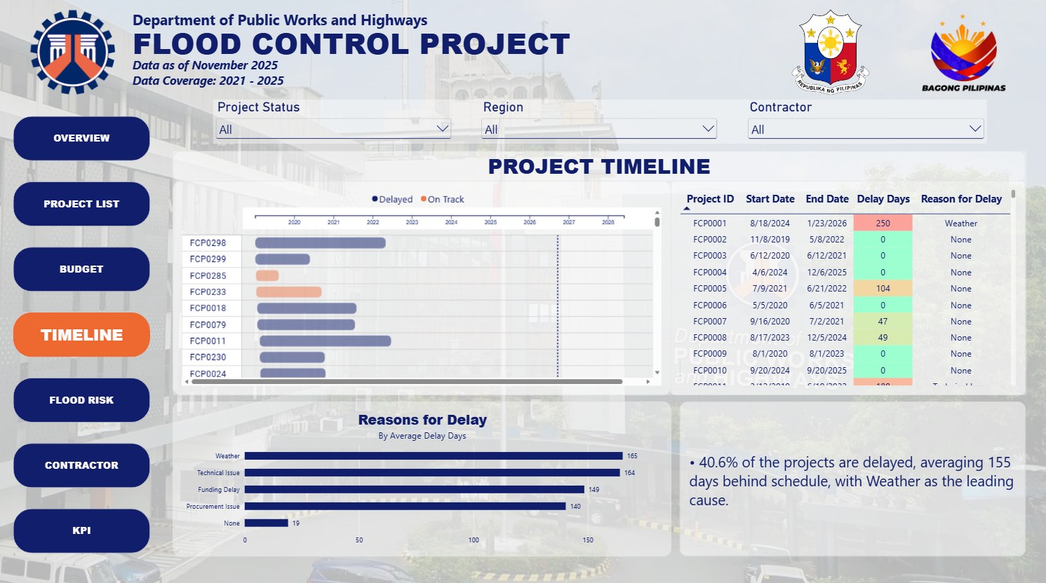
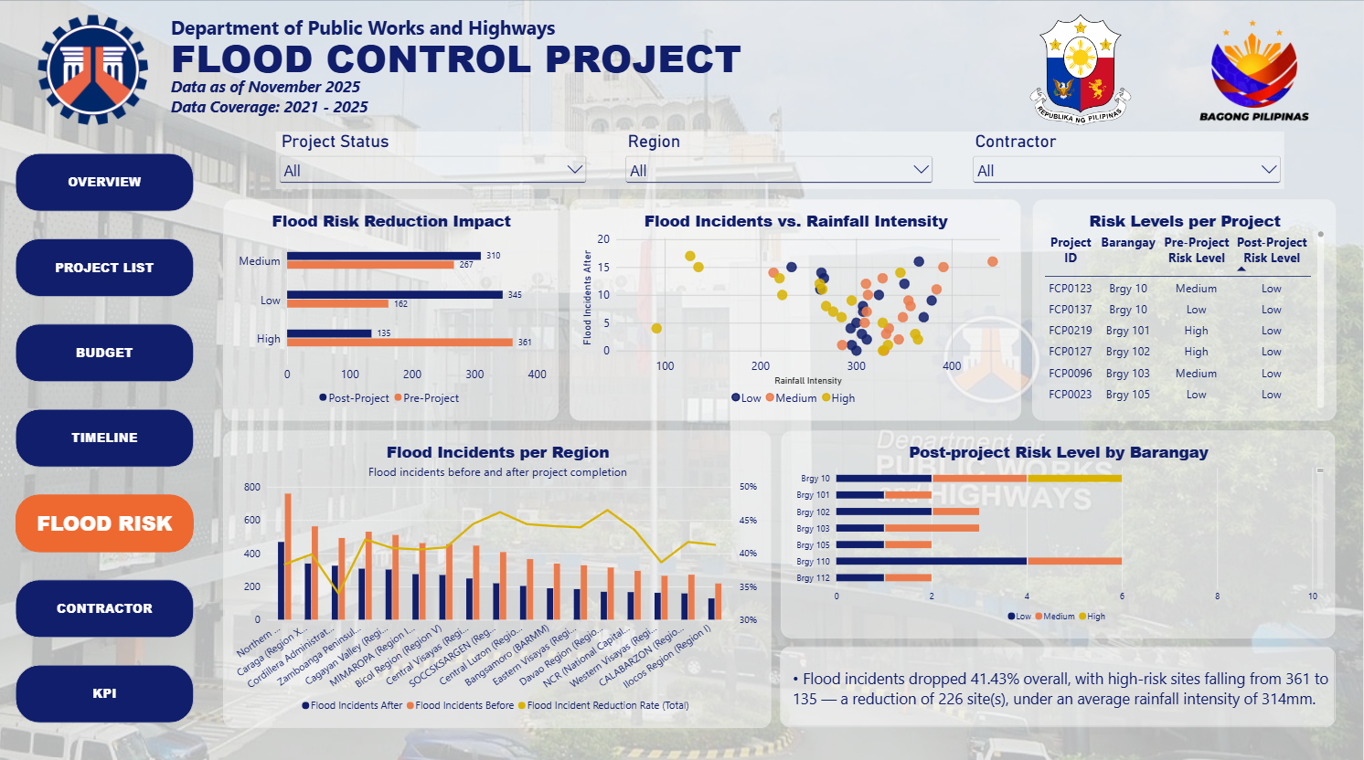
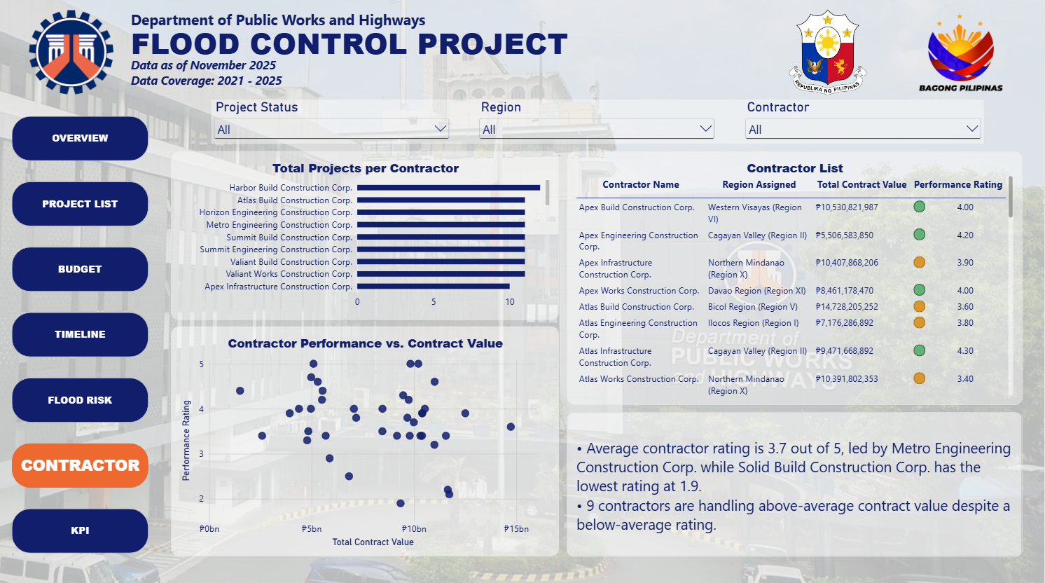
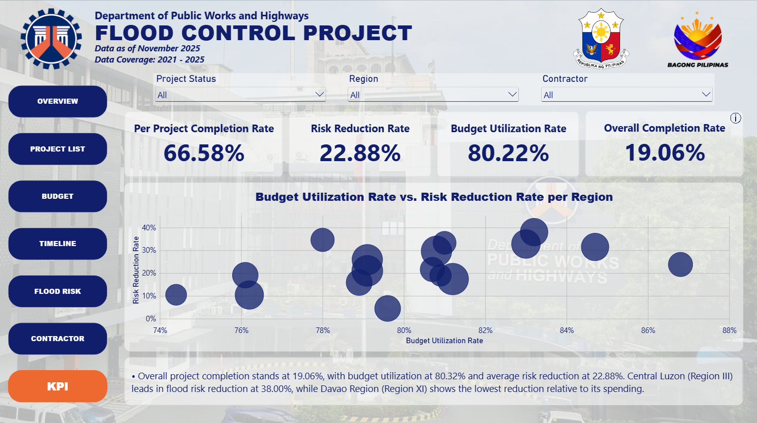
Government infrastructure agencies like DPWH often manage hundreds of concurrent projects, with data on budgets, timelines, contractor performance, and risk levels scattered across disconnected spreadsheets. This fragmentation makes it difficult for stakeholders to answer basic but critical questions in real time: Which projects are behind schedule? Where is the budget being over- or under-utilized? Which regions remain at high risk despite completed interventions? How are individual contractors performing across their portfolios?
This project simulates that scenario using a synthetic dataset modeled on a DPWH Flood Control Project portfolio (320+ projects), built as the final requirement for a Power BI Training workshop with Excelhelpline Analytics PH. The goal was to design an interactive Power BI dashboard that unifies project, budget, timeline, flood risk, and contractor data into a single connected data model, enabling stakeholders to filter, drill down, and monitor project performance across a full portfolio in real time, rather than relying on static, siloed reports.
Note: built on a synthetic dataset for training purposes.