A live underwriting view of profitability, competitiveness, and retention across a commercial insurance book.
Summary
One book, four underwriting questions.
This Power BI dashboard delivers a full-year 2025 performance analysis, with 2024 comparison, for a Moving & Storage MGA's commercial book. It covers Package (PKG) and Workers' Compensation (WC) business across roughly 1,000 renewal accounts, 154 brokers, and 48 states. Built on a star-schema model with dedicated fact tables for policies, losses, new business, and renewals, the report turns the same analytical problem as the companion Excel dashboard into an interactive Power BI experience.
Across Overview, Loss Ratio, Hit Ratio, and Retention pages, shared slicers, KPI alerts, trend visuals, rankings, geographic analysis, and more than 75 context-aware DAX insight measures help an underwriter move from the headline number to the relationship, territory, coverage, or reason behind it.
The question
Can the same underwriting story work in both Excel and Power BI?
Insurance analytics teams often work across both platforms: Excel remains central to underwriting and finance workflows, while Power BI supports scalable, self-service reporting. This project addresses that mixed-tool reality by rebuilding the same commercial lines performance dashboard in Power BI from the same anonymized dataset and metric definitions used in the Excel version.
The goal was not simple duplication. Excel uses Power Query, Power Pivot, DAX, and VBA-driven automation; Power BI required relationships, slicer-driven interactivity, native report canvas design, and DAX narrative logic rebuilt from first principles. Both versions answer the same questions: Is the book performing? Are we winning or losing business, and why? Are we retaining the accounts and premium we should be?
Inside the report
Page Features
Overview
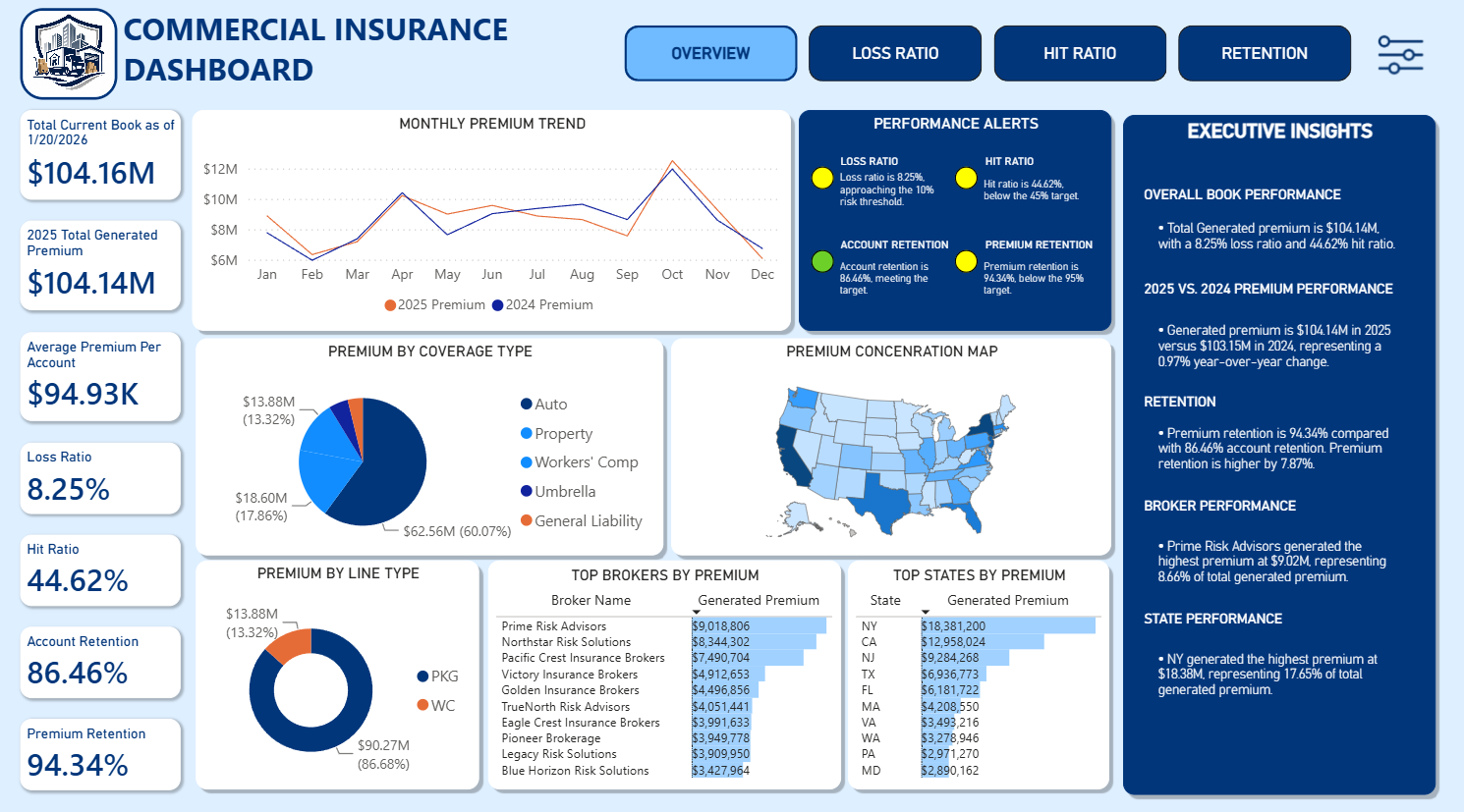
The executive landing page combines Total Current Book, Generated Premium, Average Premium per Account, Loss Ratio, Hit Ratio, Account Retention, and Premium Retention. A monthly premium trend, coverage and line composition charts, state concentration map, broker and state rankings, performance alerts, and an Executive Insights panel provide a fast read on what deserves attention next.
Overview
Loss Ratio
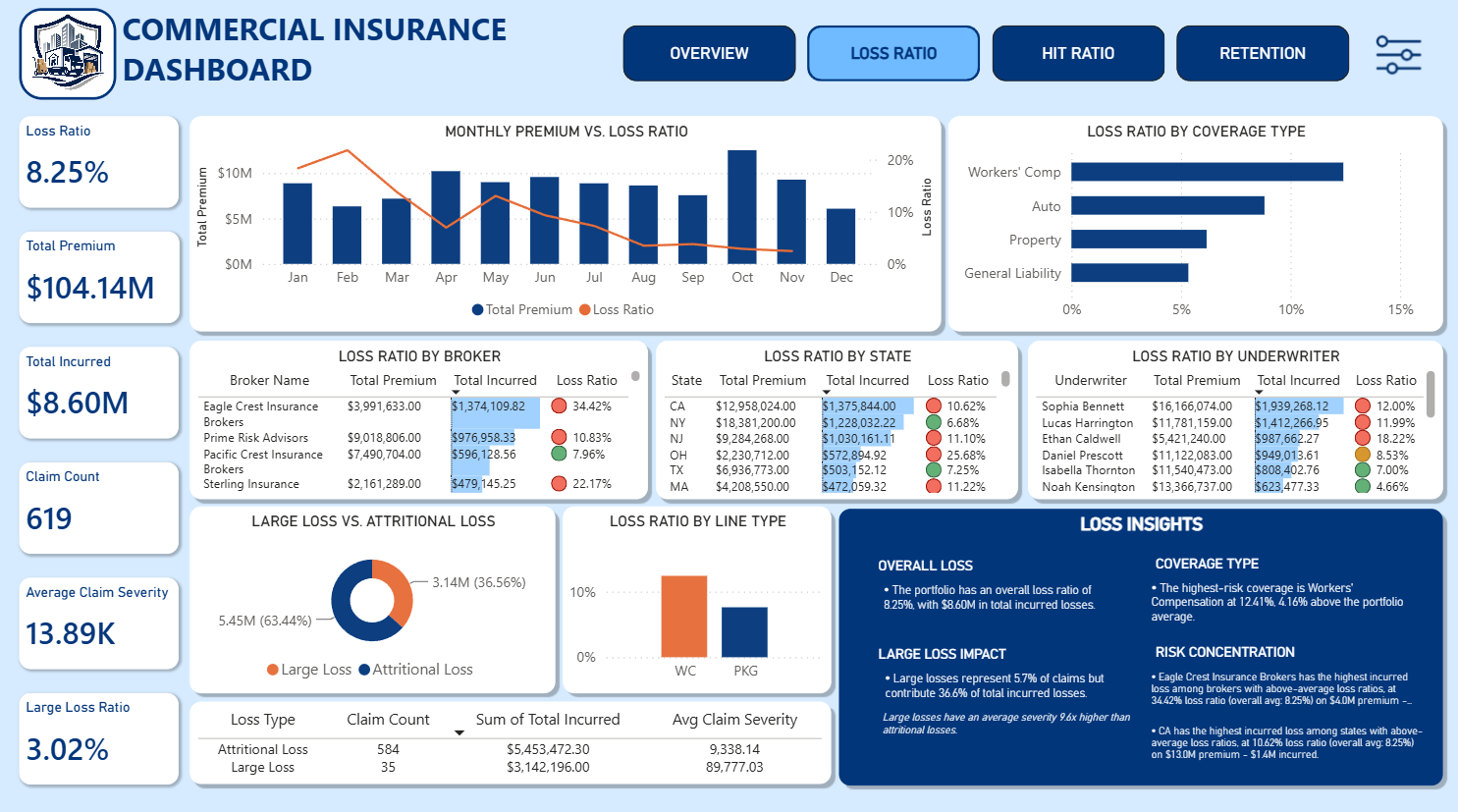
This page explains whether the book is profitable and what is driving the result. Premium versus loss-ratio trends, coverage and line breakdowns, underwriter, broker, and state tables, plus the Large Loss versus Attritional Loss split distinguish frequency problems from severity and large-loss impact.
Loss Ratio
Hit Ratio
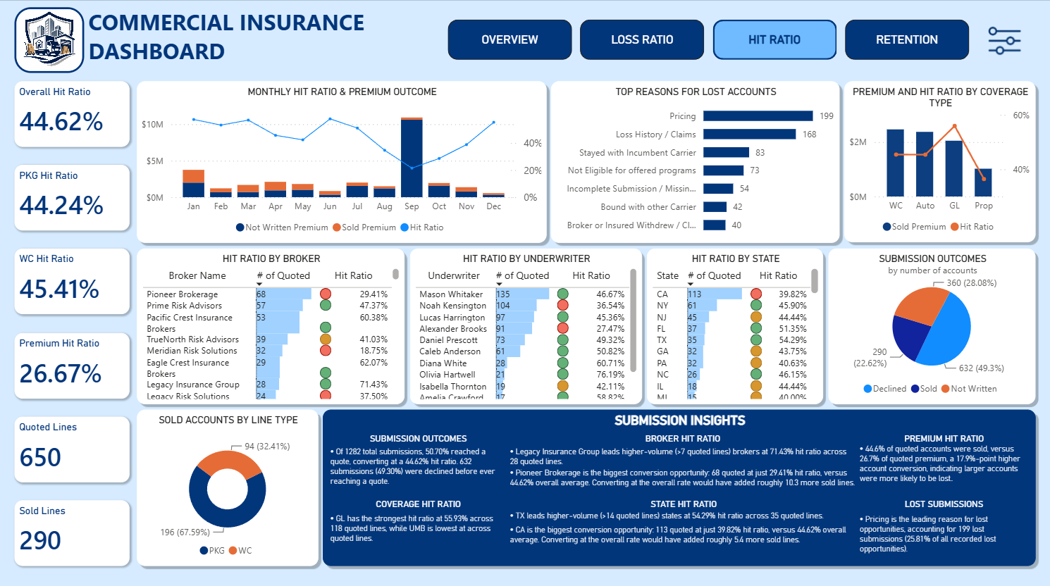
The competitiveness page follows quoted and sold lines, premium hit ratio, WC and PKG performance, and monthly outcomes. Lost-account reasons, coverage-level comparisons, broker, state, and underwriter rankings, and the Sold / Not Written / Declined funnel identify where conversion is strongest and where underwriting opportunity is largest.
Hit Ratio
Retention
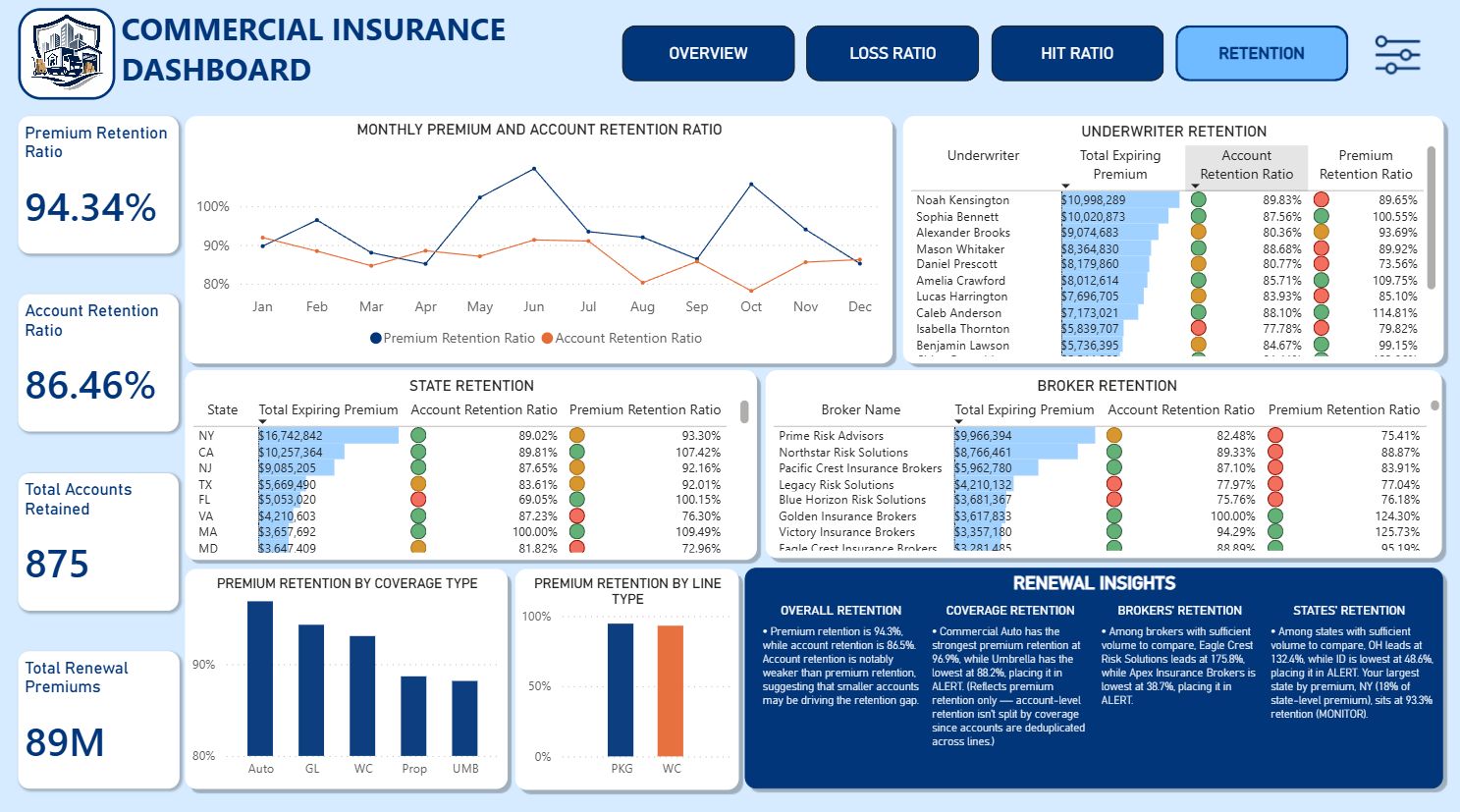
The retention page compares premium and account retention over time, then surfaces leakage by broker, state, underwriter, coverage, and line type. Materiality-guarded Renewal Insights distinguish a meaningful retention gap from a small-sample fluctuation and show whether the book is retaining small accounts while losing larger premium.
Retention
Methodology
Context-aware underwriting commentary.
The report uses a star-schema model linking policy, loss, new business, and renewal fact tables to broker, state, date, coverage, line, and underwriter dimensions. DAX measures calculate the shared KPI definitions, 2024 comparisons, threshold-based performance alerts, and the ranked breakdowns used across all four pages.
More than 75 DAX-driven narrative measures generate filter-aware commentary such as top lost-reason analysis, large-loss severity framing, broker and state retention gaps, and hit-ratio opportunity sizing. These measures are guarded against small samples and single-entity distortion, and return blank when the available data does not support a defensible statement.
Data transformation, cleaning, and preparation for the reporting model
DAX
Loss ratio, hit ratio, retention, YoY comparisons, alerts, rankings, and dynamic insight measures
Data Model / Relationships
Star-schema relationships across policy, loss, new business, renewal, and dimension tables
Shape Map
State-level premium concentration with tooltip detail
SQL Server
Policy data queried from the agency management system
Data Anonymization
Identifying fields replaced with fictional values for portfolio use
Data disclosure
Built for demonstration, grounded in the book.
The dataset is fake data modeled on a real MGA book structure. Insured names, underwriter names, broker names, policy IDs, claim IDs, and other identifying fields were anonymized or replaced with fictional values before use. Financial and analytical figures were preserved so the relationships and performance patterns remain consistent with the source structure while protecting sensitive business information.
Interactive report
Live Dashboard
Glossary
Term
Definition
How it's calculated
How to interpret
Generated Premium
Premium from policies successfully bound/written.
Sum of generated/bound premium
Higher generally indicates greater premium production.
Quoted
Number of opportunities that received a quote.
Not Written + Sold
Represents the quote volume used in Hit Ratio.
Sold
Number of quoted opportunities that were successfully written.
Count of sold opportunities
Used as the numerator of Hit Ratio.
Hit Ratio
Percentage of quoted opportunities that were successfully sold.
Sold / Quoted
Higher is generally better.
Loss Ratio
Losses relative to generated premium.
Incurred Loss / Generated Premium
Lower generally indicates better underwriting performance.
Premium Retention
Percentage of prior-period premium retained.
Retained Premium / Prior Premium
Higher indicates stronger premium retention.
Account Retention
Percentage of prior accounts retained.
Retained Accounts / Prior Accounts
Higher indicates stronger customer retention.
Large Loss
A loss classified as materially larger than typical attritional losses.
Based on project classification
Highlights losses with disproportionate impact.
Attritional Loss
More routine losses that make up the normal loss experience.
Based on project classification
Used as a comparison against large losses.
Alert
Performance requiring attention.
Based on KPI thresholds
Indicates performance below the defined acceptable level.
Monitor
Performance that warrants observation.
Based on KPI thresholds
Indicates performance between Healthy and Alert.
Healthy
Performance within the desired range.
Based on KPI thresholds
Indicates satisfactory performance.
Let's make something useful.
Have a dataset, dashboard, or business question that needs a clearer answer?